Ervas
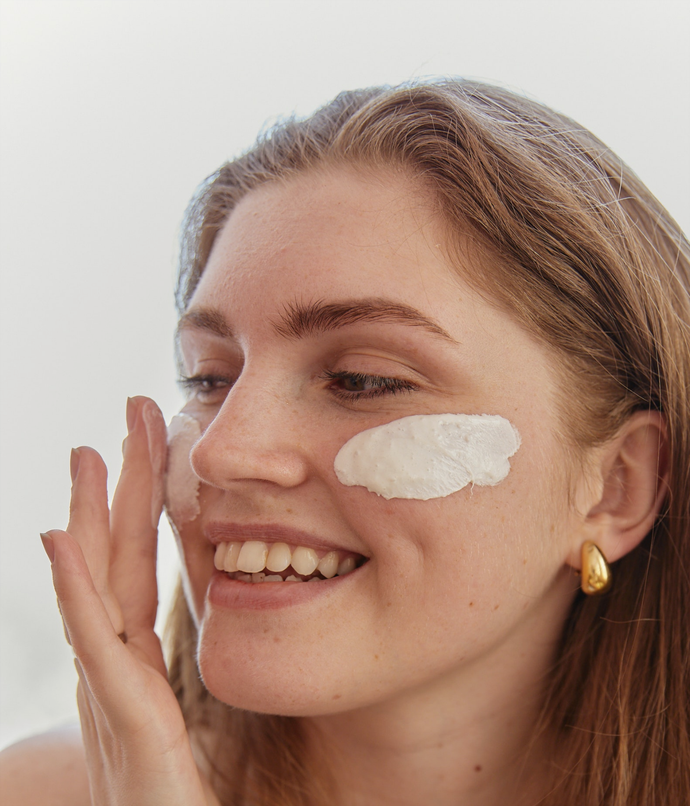
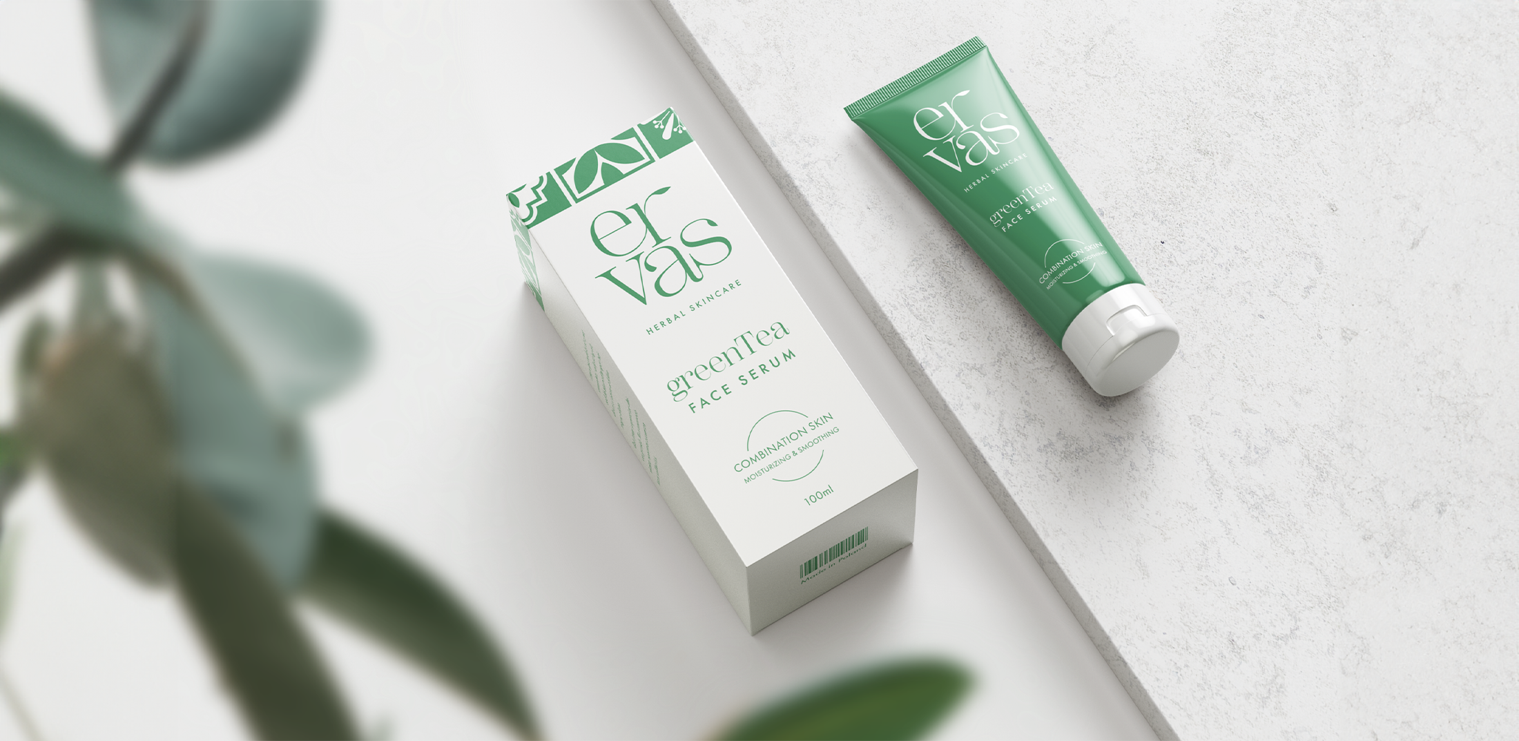
Visual identity & animationErvas is a portuguese company that produces cosmetics with natural ingredients. The private project involved creating a simple logo, packaging design for two creams in tubes and a short advertising animation.
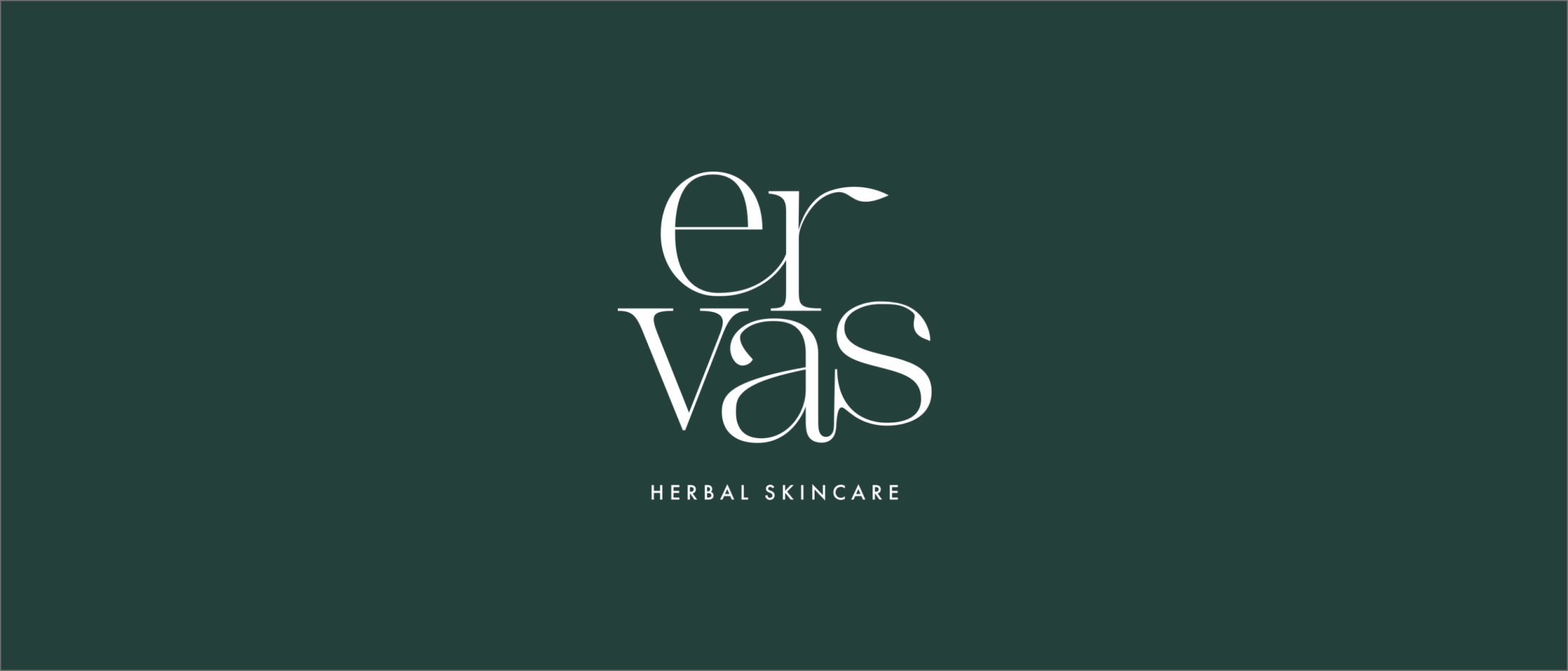
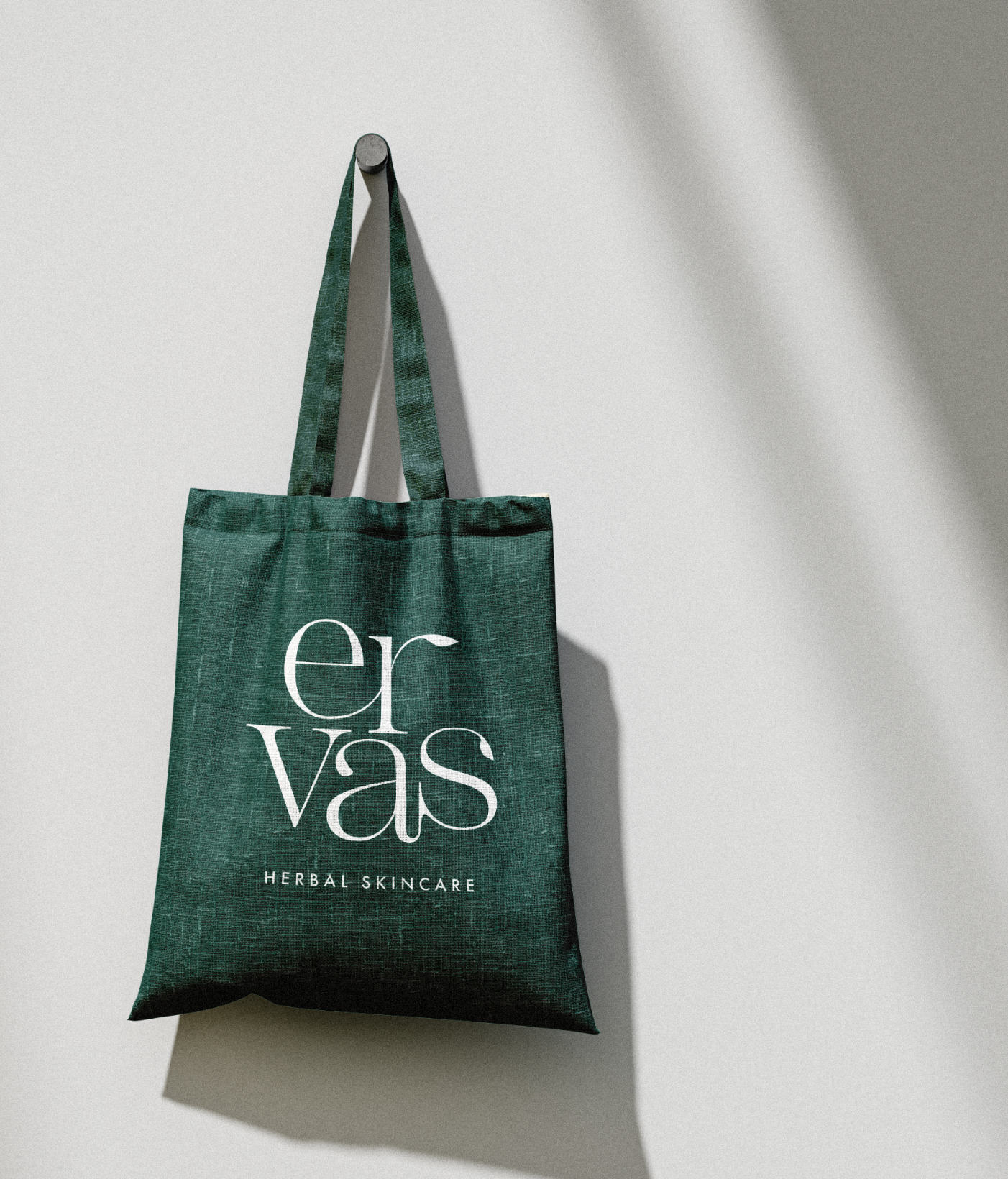
The result of the project is a minimalist logo with modified typography based on a serif typeface. Extending some letter elements made it possible to transform them into leaves, which reflected the natural, Mediterranean, herbal atmosphere of the brand.
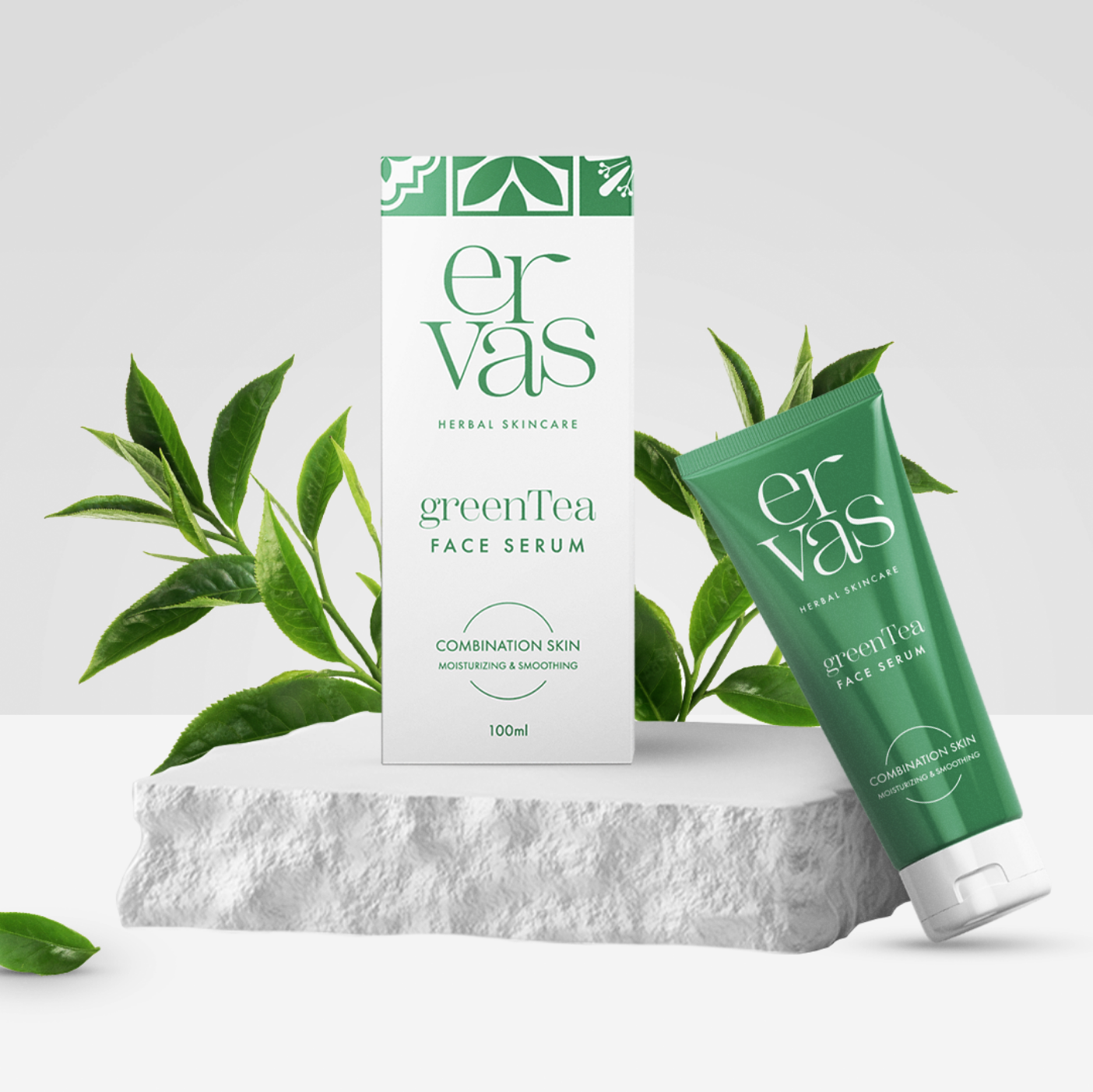
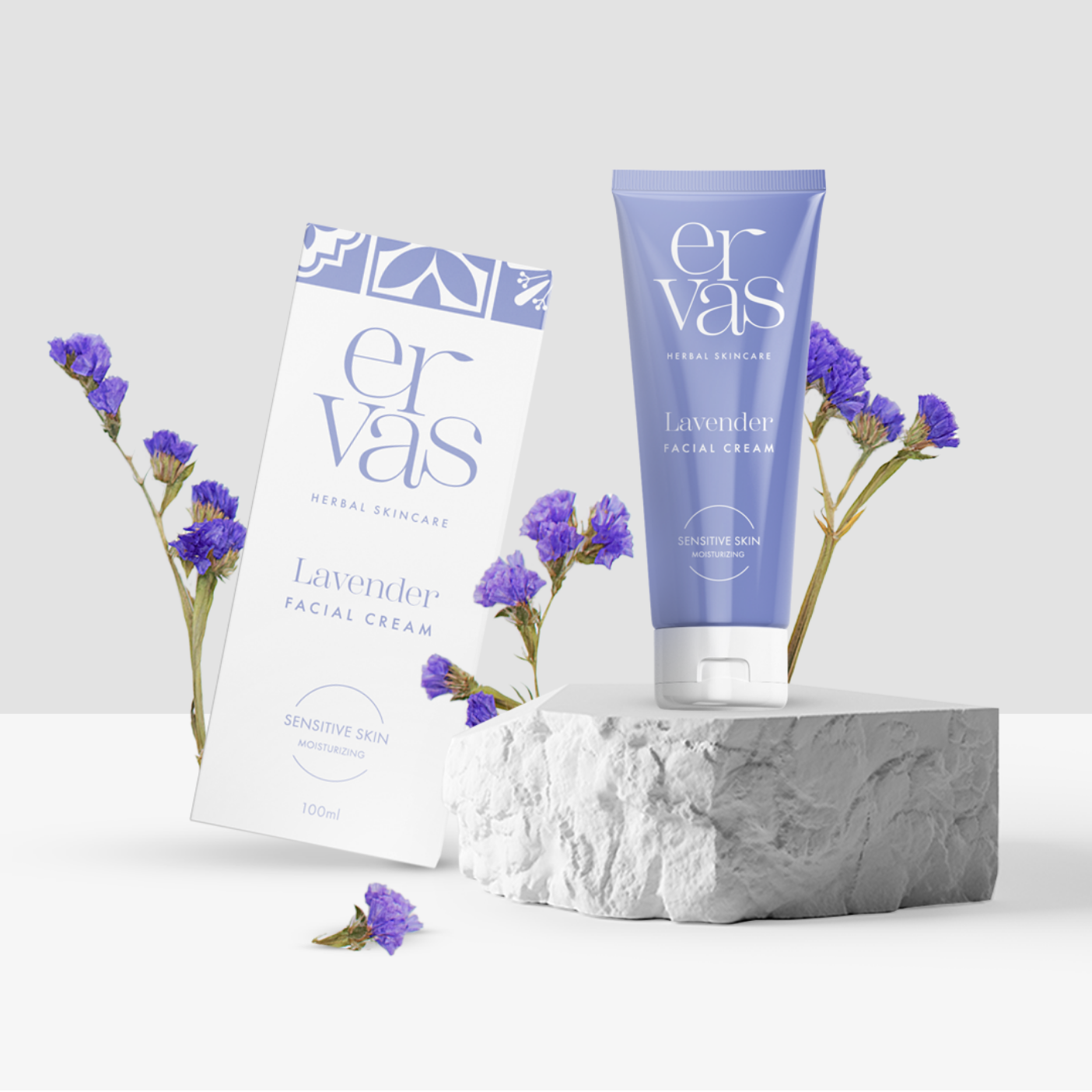
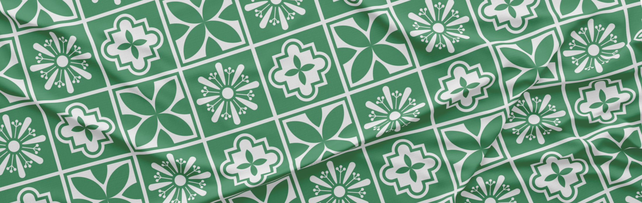
I used simple, clear and modern typography in the packaging that does not overwhelm the logo. I used patterns of traditional Portuguese tiles as a base for the vector pattern on the top of the boxes. This emphasizes the origin of the brand and is an interesting pattern that can be used in further materials and products.